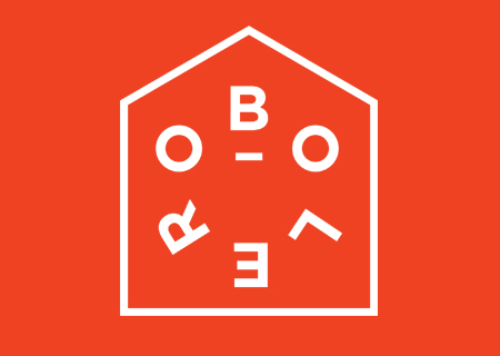

Suunto Movesense
Wearable technology brand, Movesense, wanted a new brand identity that would represent movement, high technology, and an affiliation to its parent brand Suunto. I used the triangle from Suunto’s logo, their typeface, and red color to build visual relationship.
A triangle is made up of individual dots which makes it appear more intricate. It gives you a perception of precision and attention to detail. The dots in unison add up to something greater than the whole – fitness.
The dots in unison add up to something greater than the whole – fitness.


More WORK